What Is SCSS?
SCSS is an extension to CSS that was first rolled out in 2006 and is still commonly used to this day. SCSS provides the opportunity for developers to writer better nested code, it encourages and allows developers to write cleaner code that is easier to make responsive across screen sizes, and ultimately, the code is far more efficient. In a recent project I was able to utilize SCSS in a research project where I was assigned the task of finding a company’s current website and giving it a face lift. The site I chose was for a recently opened dry bar local to me, The Vibe.
To begin the process I did a brief site crawl where I went through and analyzed every page of the current site. Using Photoshop, I was able to download and optimize the assets as well as figure out what typography and what color scheme I would be using for the project. Once I collected my data, it was time to create my SCSS files to help the idea become a reality.
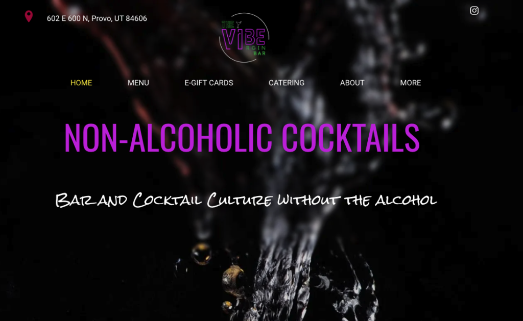
The official hero shot of The Vibe website
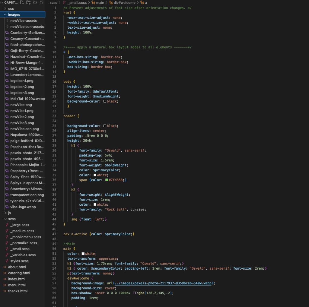
Screenshot of file organization and some of the code from _small.scss that set the main standards of css to be inherited across screen sizes
The Process
To begin I created a folder to hold the project in and organized the sections of the project into individual folders (css, images and scss). Once things were ready to be organized, I moved image assets into its folder and created my SCSS files. By creating SCSS files with a “_” to begin, you’re able to create sub sections of the overall SCSS file, this is what allows you to organize the SCSS based on purpose and responsiveness. Once these were created, I created a styles.scss file that would import all the sub SCSS files and create it into the css. Now that everything was ready to go, it was time to create our project in Visual Studio Code.
As a best practice, I began the project working on the mobile responsiveness first, because once you have the mobile responsiveness figured out, it’s much easier to adjust and fix the code for the larger files that are inheriting from the small version than it is to go in the reverse.
Utilizing CSS techniques like flexbox and grid, mingled with the nesting capabilities of SCSS, I was able to finish the product in a decent amount of time and the end result was exactly what was hoped for.
Results and Takeaways
This project was a huge success for me and an amazing learning experience. It helped me better understand the method of “mobile-first” web development and how much this method can improve all things front-end development. I also learned how to better use CSS tools like grid and flexbox. Additionally, I learned how to write more efficient SCSS code by nesting code and utilizing the unique tools of SASS and SCSS. I also learned how to utilize software like Adobe Photoshop to take a given project and dissect it in order to produce more precise products for clients and overall feel more prepared to take on any future Front-End Development projects or interviews.
To improve on this project and other projects later on, I want to be able to have less gapping and less spacing between objects that are created within grids and continue to develop the habit of being a “mobile-first” developer. This way of thinking has helped me improve all kinds of projects from my past, and have helped me develop a more efficient and effective way of thinking when I look forward to future projects. I also want to continue to have SCSS be a keystone to my front-end developmental success as it is so useful in utilizing better organization, faster development, and better capabilities through nesting and other unique optimization functions found within SCSS and not always possible in CSS. In the near future I plan on doing a rework of this project using my original start files and rehashing things utilizing more of the SCSS capabilities and create a more engaging platform that makes the site have a greater overall feel and experience than its original model that is a Shopify site. Because while Shopify is convenient and has some neat features, they don’t have anything I can’t create and I know that with SCSS I can make something more fresh and user-friendly than “another Shopify site” can.
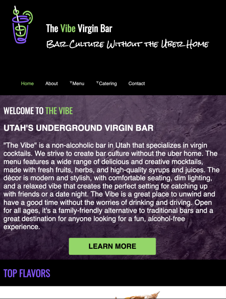
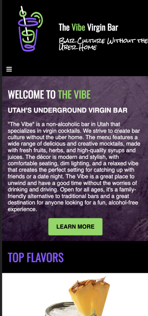
Current The Vibe Home Page

Current The Vibe Mobile Home Page
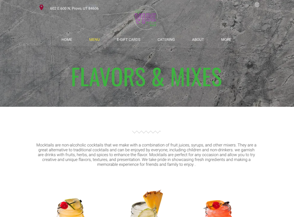
My The Vibe Home Page Redesign
My The Vibe Mobile Home Page Redesign
Mason Dietrich is a student in the Digital Media program at Utah Valley University, Orem Utah, studying Web & App Development. The following article relates to the Capstone Project in the (DGM 2740 Course) and representative of the skills learned.